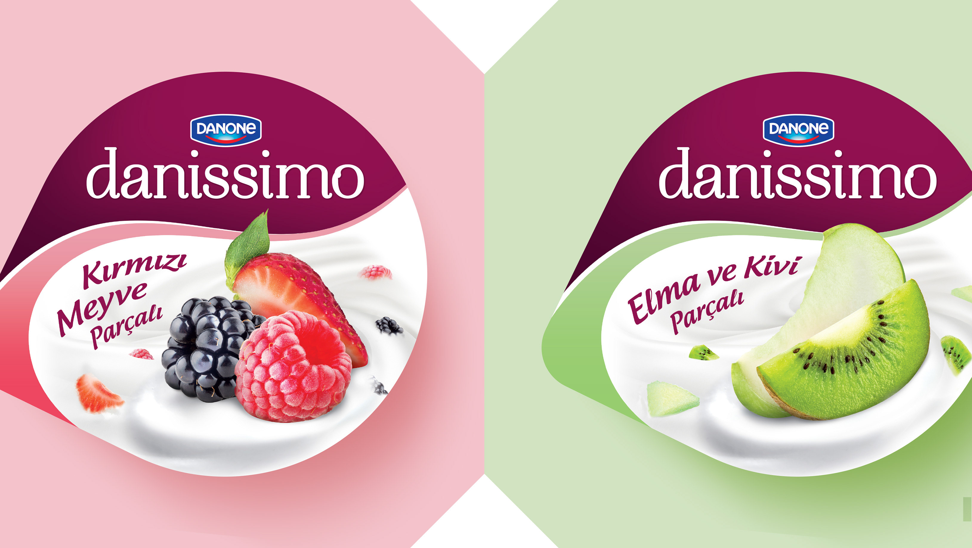
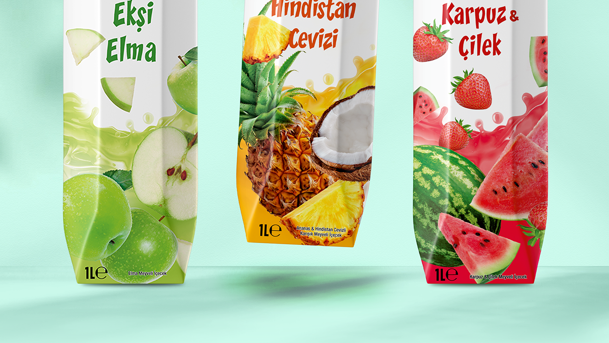
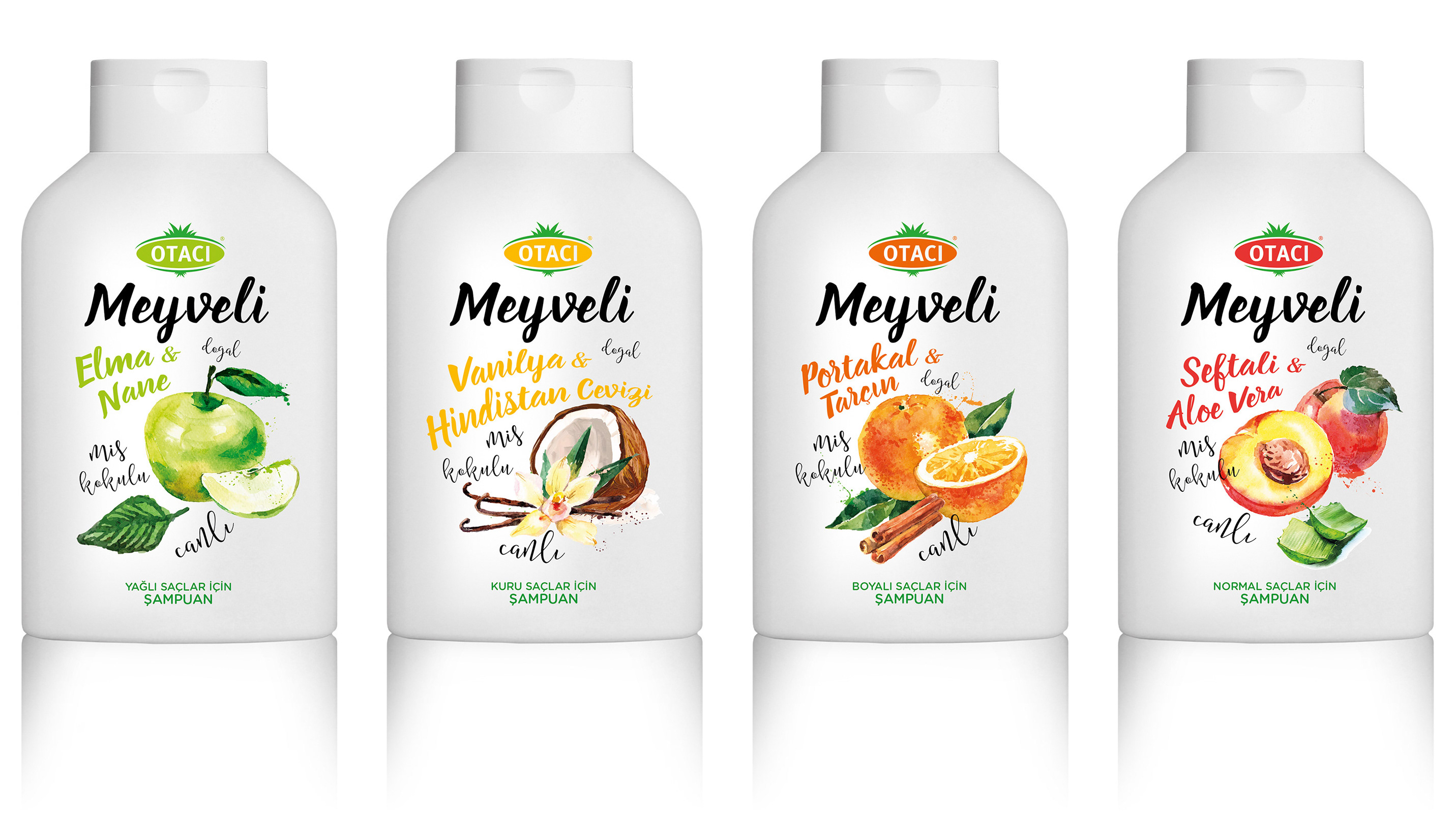
Strengthened the product’s presence in the category through a clear and cohesive packaging system.
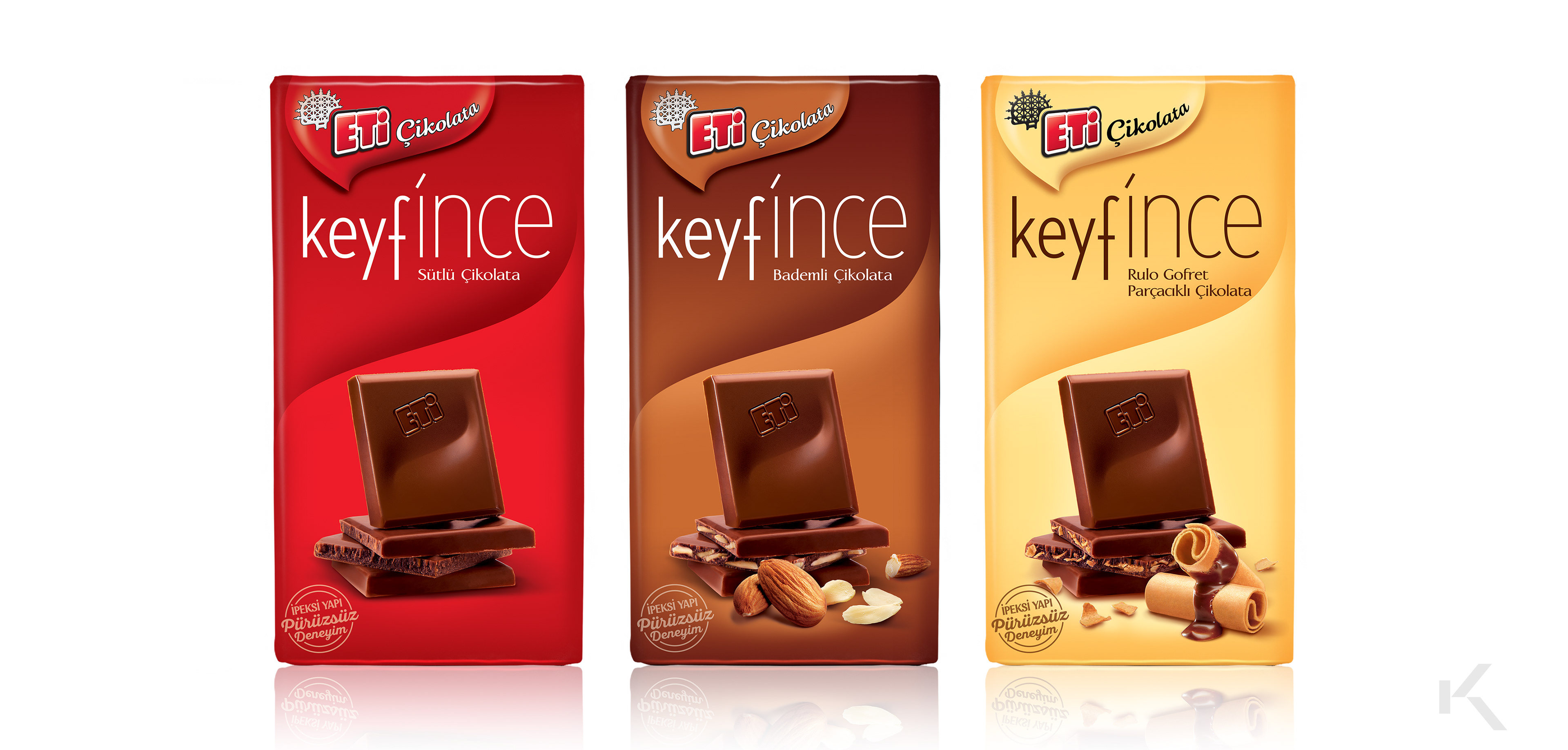
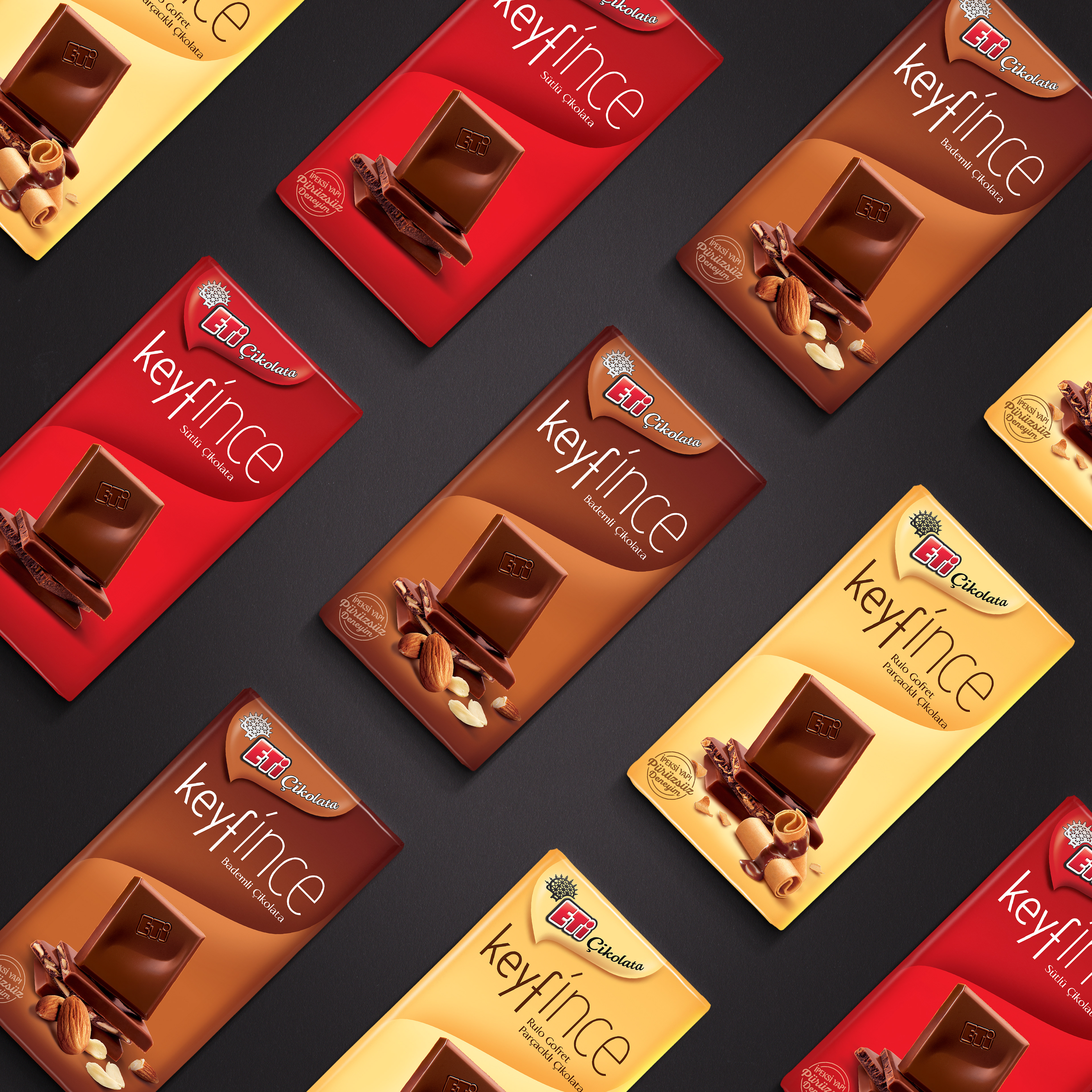
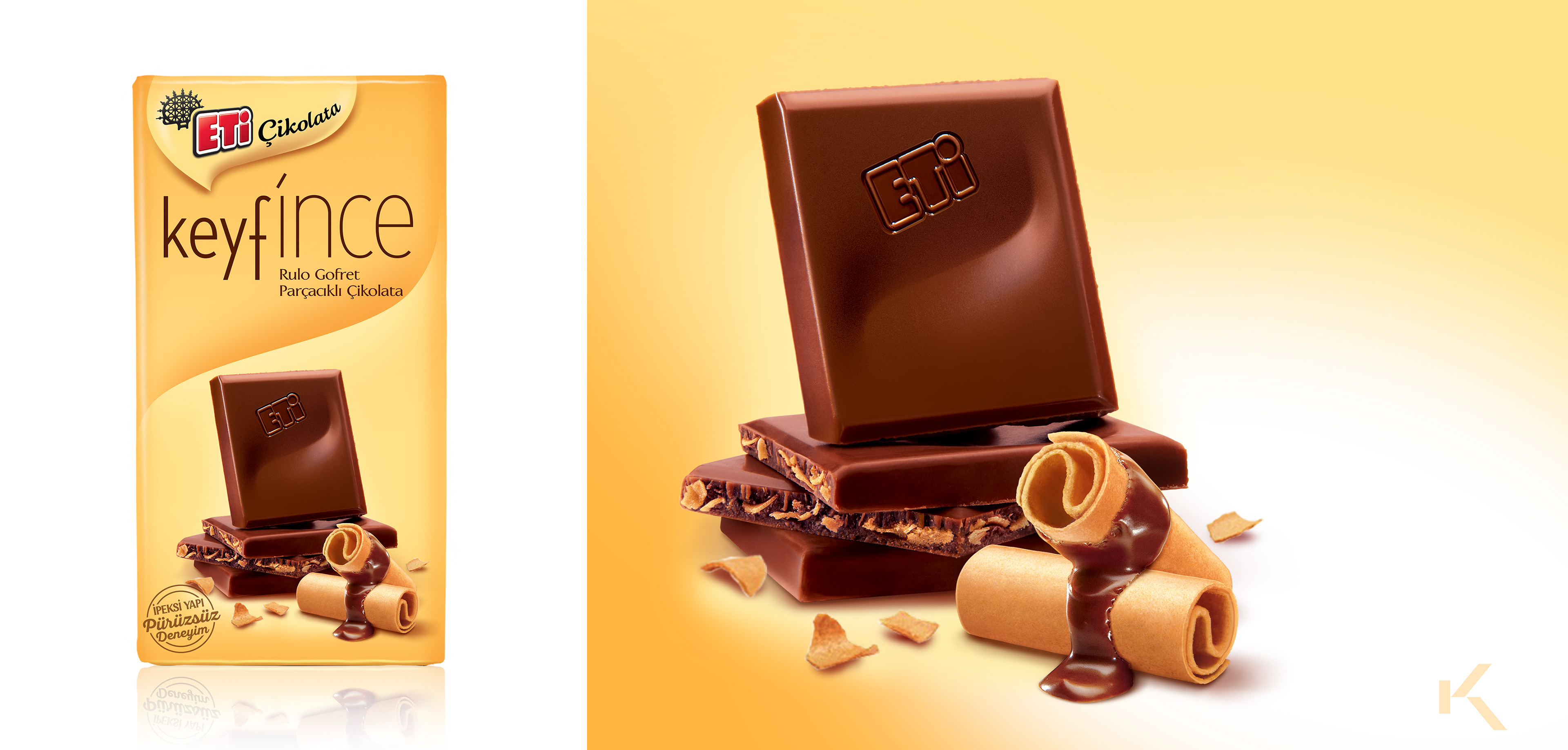
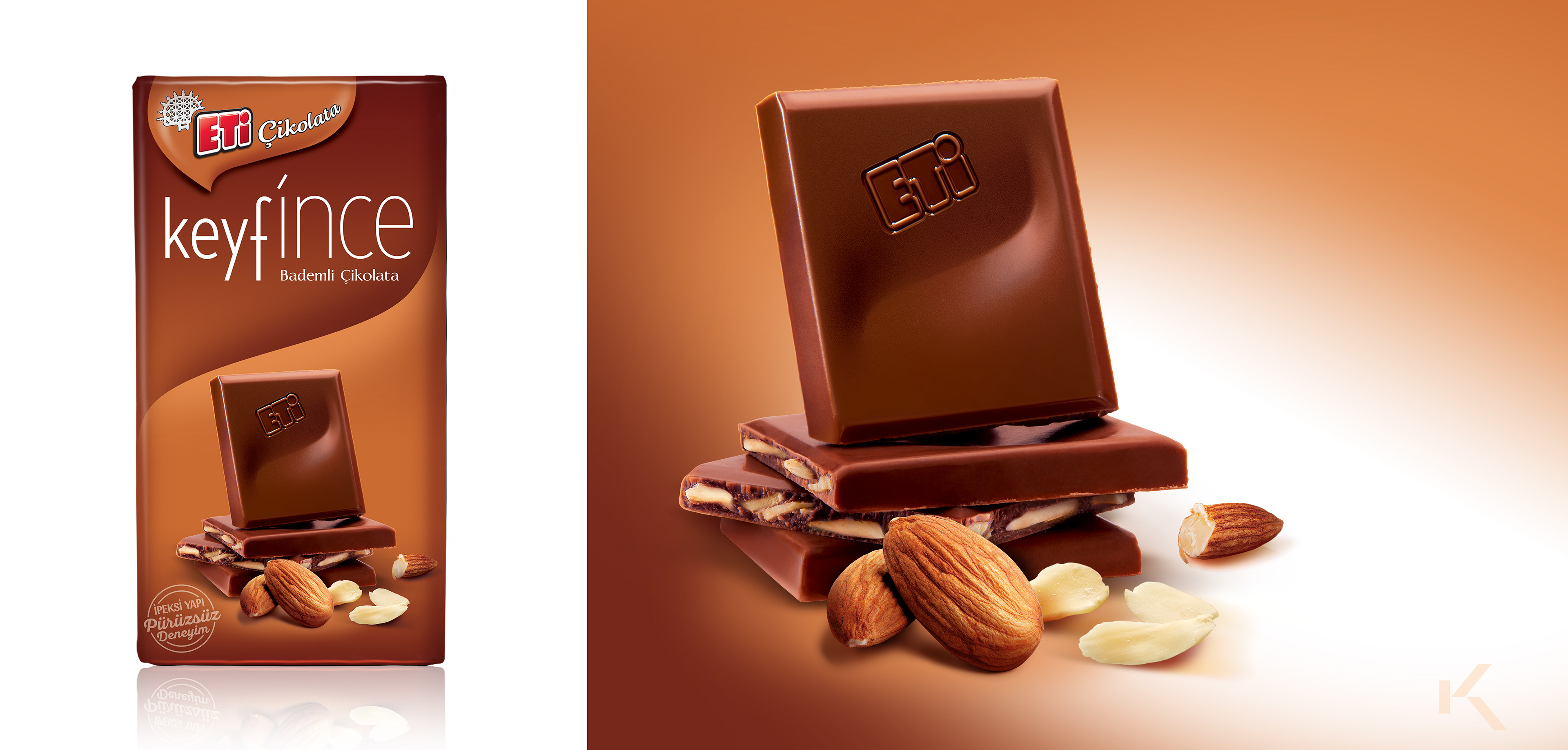
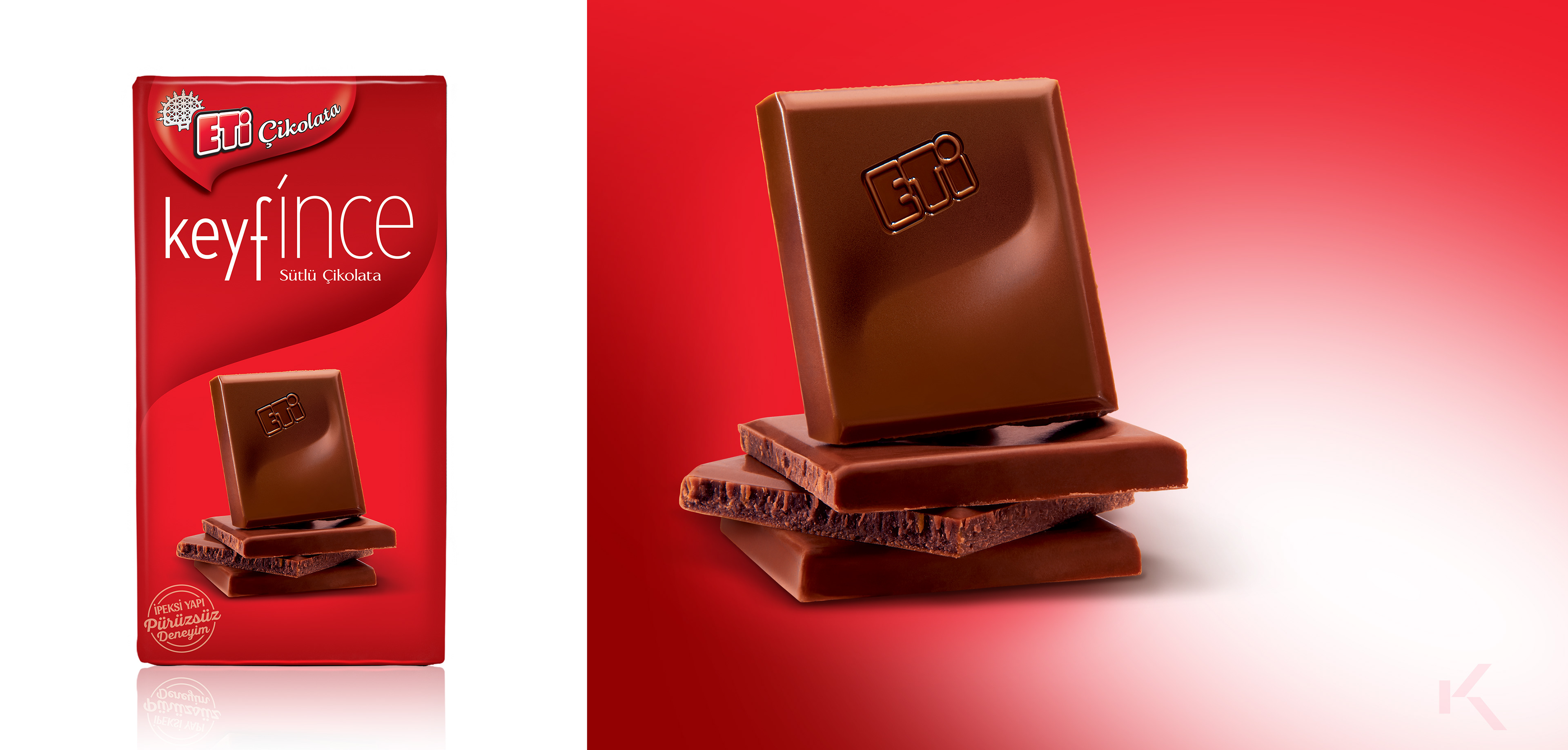

Art direction and development of the sub-brand identity and packaging system for a new chocolate line introducing a thinner format, including logotype design and indulgence-driven product imagery. The sub-brand name “Keyfince” was designed to combine the ideas of “thin” and “pleasure,” creating a distinctive and memorable reference to the product’s eating experience. Retouching in collaboration with Gio.